
Internal Color Reference
Color Direction Lab
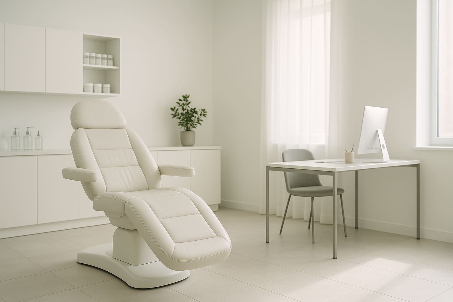
This page now acts as the internal swatch reference for the live Beauty Medica theme, while still previewing alternate color directions inside the same framework.
Brand Lab Index
Review Artifacts
Quick links to the internal pages we are using for Elena review, content decisions, and visual direction.
Patient Stories Review
Extracted feedback, phone lookup items, private exclusions, and testimonial display concepts.
Open pageElena Treatment Graph
A simplified view of patient language, clinical sorting, treatment classes, and named products.
Open pageTheme Block Lab
Live section examples and component checks for the current Beauty Medica visual system.
Open pagePinned Media Control Lab
Short-hold pinned media prototypes for tuning the fixed visual behavior.
Open pageBeauty Medica Color Handoff
Palette notes and handoff context for brand review.
Open pagePurple Core Preview
Sitewide preview direction using the purple/violet Beauty Medica palette.
Open pageDeep Purple Preview
Alternate sitewide preview direction with deeper purple contrast.
Open pageFoundry Control Managed Form
Draft-only form artifact. It exists in content but is not rendered in the normal local preview.
Draft file only. Not rendered in the normal local preview.
Live Palette
Canonical Site Colors
Violet
- Use for Brand Lab artifacts, visual review pages, and purple-led emphasis.
- Keeps internal review pages aligned with the purple direction.
Deep Purple
- Use for hero overlays, premium sections, and high-trust internal artifacts.
- Gives the purple palette weight without feeling loud.
Jade + Gold
- Use sparingly for CTA warmth, highlights, and small proof details.
- Do not let these overpower the purple Brand Lab direction.
Lavender Surfaces
- Use for internal review pages, cards, and calm background sections.
- Keeps the review layer lighter while still reading purple.
Shared Brand Core
Use One Main Identity Site-Wide
This is the recommended default for most pages: premium clinical, calm, and conversion-focused. It keeps your brand coherent while still allowing section-level accents.
- Use this mode for homepage hero, about, safety, and results overview.
- High trust + warmth balance with controlled contrast.
- Keeps the brand unified across all audiences.
Live Section Skins
Section-Level Modes In Active Content
Champagne Section
bm-section-champagne- Journey framing and reassurance blocks
- Warm education and milestone callouts
Cool Section
bm-section-cool- Maps, process steps, and neutral resets
- Breathing room after warm or dark blocks
Men's Mode
bm-men-mode- For /for-men/ and men-specific service storytelling
- Sharper, performance-led, more restrained
Dark Premium Modes
bm-dark-abyss and bm-section-ocean- Authority, trust, premium contrast, full-bleed emphasis
- Dark CTA sections and differentiator sections

Women-Leaning Section Example
Warm, Elegant, Comfort-Forward
Use this as a section accent where emotional tone matters most: first consultations, rejuvenation journeys, and confidence narratives.
- Softer warmth, still medically credible.
- Best used in targeted sections, not as full-site takeover.
- Pairs well with education and first-visit pathways.

Men-Leaning Section Example
Sharper, Higher Contrast, Performance Tone
Use this visual language for the men's pathway and men-specific service storytelling while staying inside the same framework and overall brand architecture.
- More contrast and stronger structure hierarchy.
- Signals precision, discretion, and confidence.
- Recommended for /for-men/ and men-targeted campaigns.
Handoff Assets
Use the handoff sheet for internal review and use the JSON export when a developer or designer needs the palette in a structured format.