
Internal Handoff
Beauty Medica Color Handoff
This page compresses the live palette into a practical handoff sheet: what exists, what is live, and when to use each section mode.
Core Families
Live Brand Tokens
Brand Lab review pages should stay inside the Violet + Deep Purple + Soft Lavender system unless a section deliberately demonstrates another mode.
Violet
The recognizable Beauty Medica purple family.
- Use for Brand Lab artifacts, visual review pages, and purple-led emphasis.
Deep Purple
Authority, contrast, and premium dark surfaces.
- Use for hero overlays, dark review graphics, and high-trust internal artifacts.
Soft Lavender
Light support surfaces for review pages.
- Use for Brand Lab cards, notes, and calm review sections.
Support Accents
Secondary accents that should not overpower purple.
- Use jade and gold sparingly for CTA warmth, proof details, and small highlights.
Section Modes
When To Switch Palettes
These are the main section-level skins already used in active page content.
Champagne
bm-section-champagne- Journey framing
- Milestone callouts
Cool
bm-section-cool- Process, maps, and visual resets
Men's Mode
bm-men-mode- Sharper, performance-led tone
Dark Premium
bm-dark-abyss and bm-section-ocean- Authority, premium contrast, dark emphasis
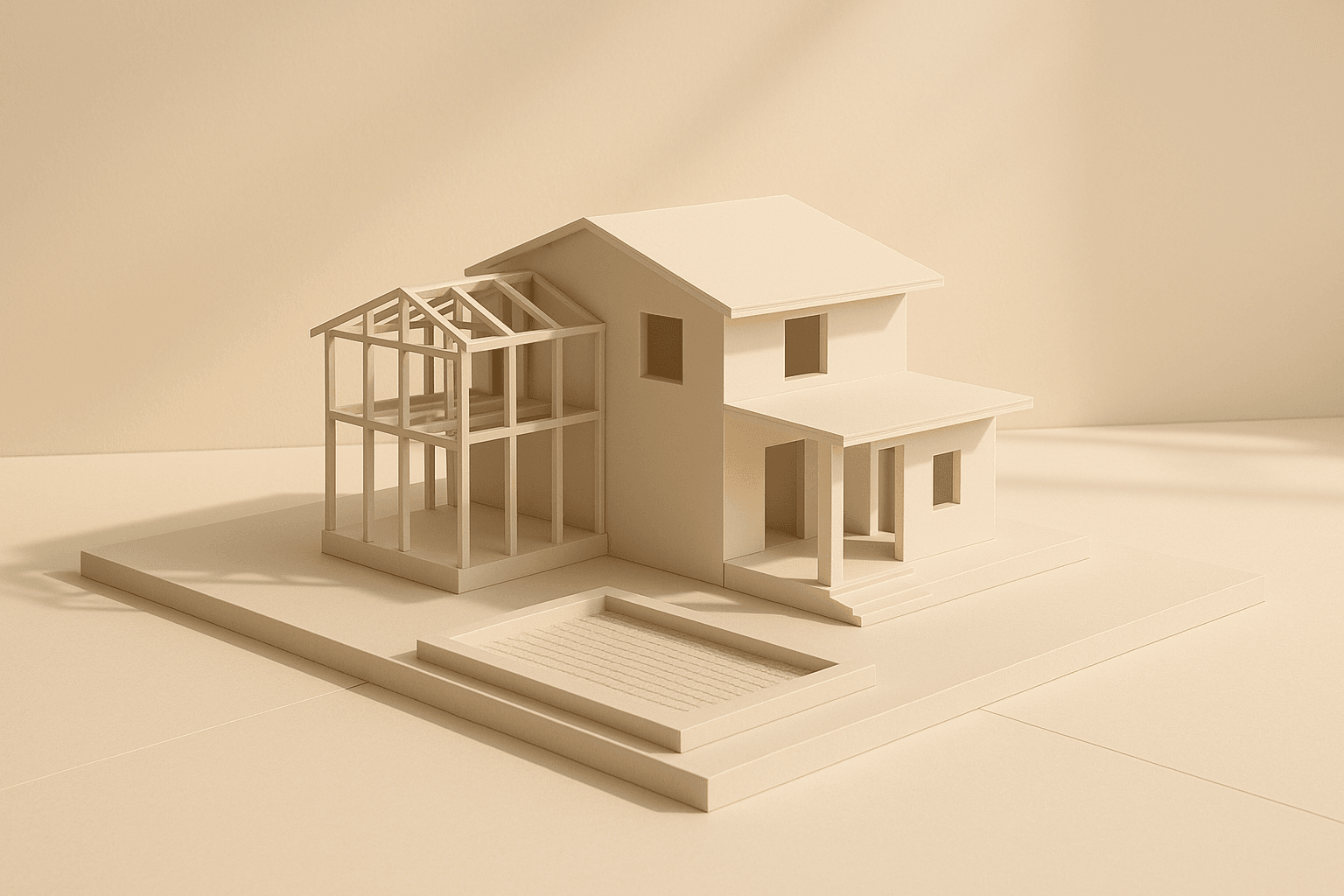
Process Image Reference
Canonical House-Metaphor Asset
The saved house-metaphor image now lives at `static/images/process/house-treatment-plan-final.png` and is the canonical version for homepage, process, and treatments. It should stay visually inside the Beauty Medica palette system documented in `static/brand-lab/beautymedica-theme-tokens.json`: violet/deep-purple structure, soft lavender support, and restrained warm-gold highlights. The goal is calm, architectural, premium, and medically structured, not colorful, playful, or construction-heavy.
- Primary fit: Violet + Deep Purple + Soft Lavender brand system
- Warm shell: soft lavender plus restrained gold support
- Use case: sequencing, foundation-first planning, structured care
- Avoid drifting into bright blue, green-first, cartoon, or noisy construction imagery